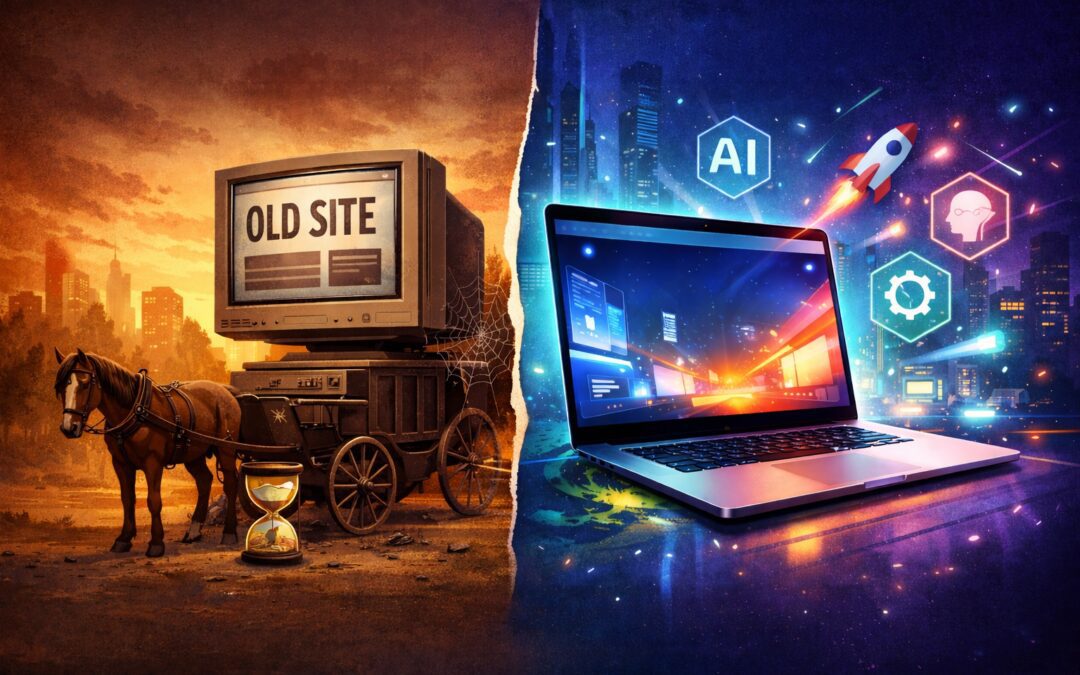
Let’s be honest: in “internet years,” a website from 2024 is practically a vintage relic. If your site hasn’t had a refresh recently, it’s like showing up to a high-speed AI gala in a horse-drawn carriage. As we charge into 2026, the digital landscape has shifted. It’s no longer just about having a “pretty” page; it’s about performance, personality, and being “AI-friendly”. If you want to stop leaving money on the table, here is why you need an update and five easy ways to do it.
The “Why”: Benefits of the 2026 Refresh
The AI Handshake: In 2026, search isn’t just humans typing keywords; it’s AI agents (like ChatGPT or Perplexity) “reading” your site to give answers. If your site structure is a mess, these AI bots will simply skip you.
The 2-Second Rule: Modern users have the patience of a caffeinated squirrel. If your site takes longer than two seconds to load, 53% of them are already clicking “back”.
Trust is Currency: A dated site screams “we might be out of business.” A fresh, modern interface builds instant authority and keeps people from bouncing to your competitor.
5 Easy Ways to Supercharge Your Site for 2026
1. Ditch the “Stock Photo” Stare
Generic photos of people in suits high-fiving are officially “cringe” in 2026.
The Fix: Use real photos of your team, your office, or your actual work. If you must use graphics, go for hand-drawn illustrations or “organic” textures that feel human, not algorithmic.
2. Embrace “Speedy” Image Formats
Those giant JPEGs from three years ago are anchors dragging your site down.
The Fix: Convert your images to WebP or AVIF formats. They offer the same crisp quality at a fraction of the file size, making your mobile load times lightning-fast.
3. Be “Inclusive by Default”
Accessibility isn’t just a “nice-to-have” anymore; it’s a legal and SEO powerhouse in 2026.
The Fix: Ensure your text has high contrast (no light grey on white!) and that every image has “Alt Text” describing what’s in it. This helps both visually impaired users and Google’s AI understand your content.
4. The “Thumb-First” Layout
By now, over 70% of your traffic is likely on mobile. If your buttons are too small to tap, you’re losing customers.
The Fix: Design for the “Thumb Zone.” Make sure all your primary Call-to-Action (CTA) buttons are at least 48×48 pixels and placed where a thumb naturally rests.
5. Clean Out the “Plugin Attic”
If you’re on WordPress, you probably have a dozen plugins you haven’t touched since the lockdown era. Each one adds weight and security risks.
The Fix: Audit your plugins monthly. Deactivate and delete anything that isn’t mission-critical. Your server (and your users) will thank you for the breathing room.
Ready for a 2026 upgrade? Don’t let your business get left in the digital dust. At Trapdoor Media, we specialise in building websites that don’t just look good—they perform. Contact us today for a site audit and let’s get you results.